

Redesigning what already works: a challenge in strategic maturity.
The Caisse de Prévoyance de l’État de Genève (CPEG) wasn’t facing a crisis of image. Its former identity was serviceable — correct, even. And therein lay the true strategic challenge: to rethink not what was broken, but what had become misaligned with the institution’s reality.
This was never a cosmetic exercise. It was about expressing an internal transformation that had already taken place. The CPEG had evolved into a forward-thinking organization: methodical, human-centered, and technologically advanced, housed in state-of-the-art facilities — yet visually stuck in a past that no longer reflected its ambitions.
In-depth interviews were conducted with employees, management, institutional partners, and beneficiaries. The key insight was unanimous: CPEG is performing well, but its visual identity no longer matches its progressive nature.
This gave rise to a simple but powerful vision: to position CPEG as “prevident, with a head start.”
A brand that embodies innovation, sustainability, modernity and humanity — values deeply embedded in its culture, now made visible.
A visual language that matches an institutional ambition.
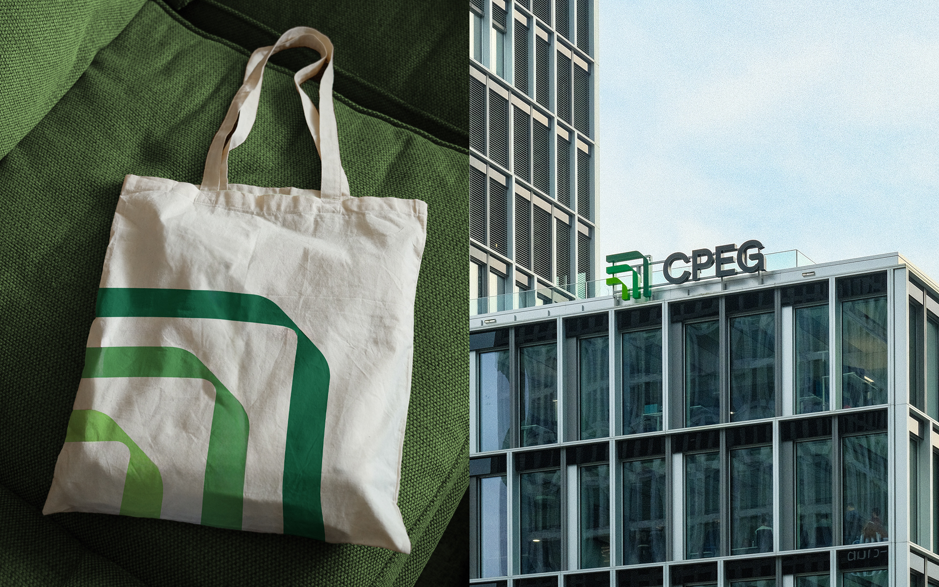
The redesigned brand identity is confident, meaningful, and precisely executed. At its core stands a bold yet elegant symbol: three upward-pointing green chevrons, nested and directed toward the top right. The form suggests growth, motion, direction, and structure — a visual metaphor for progress with discipline.
The three shades of green evoke sustainable growth, from sprout to tree — a natural parallel with the lifecycle of provident planning. The custom typography is sharp, legible, and resolutely modern, reinforcing clarity and trust.
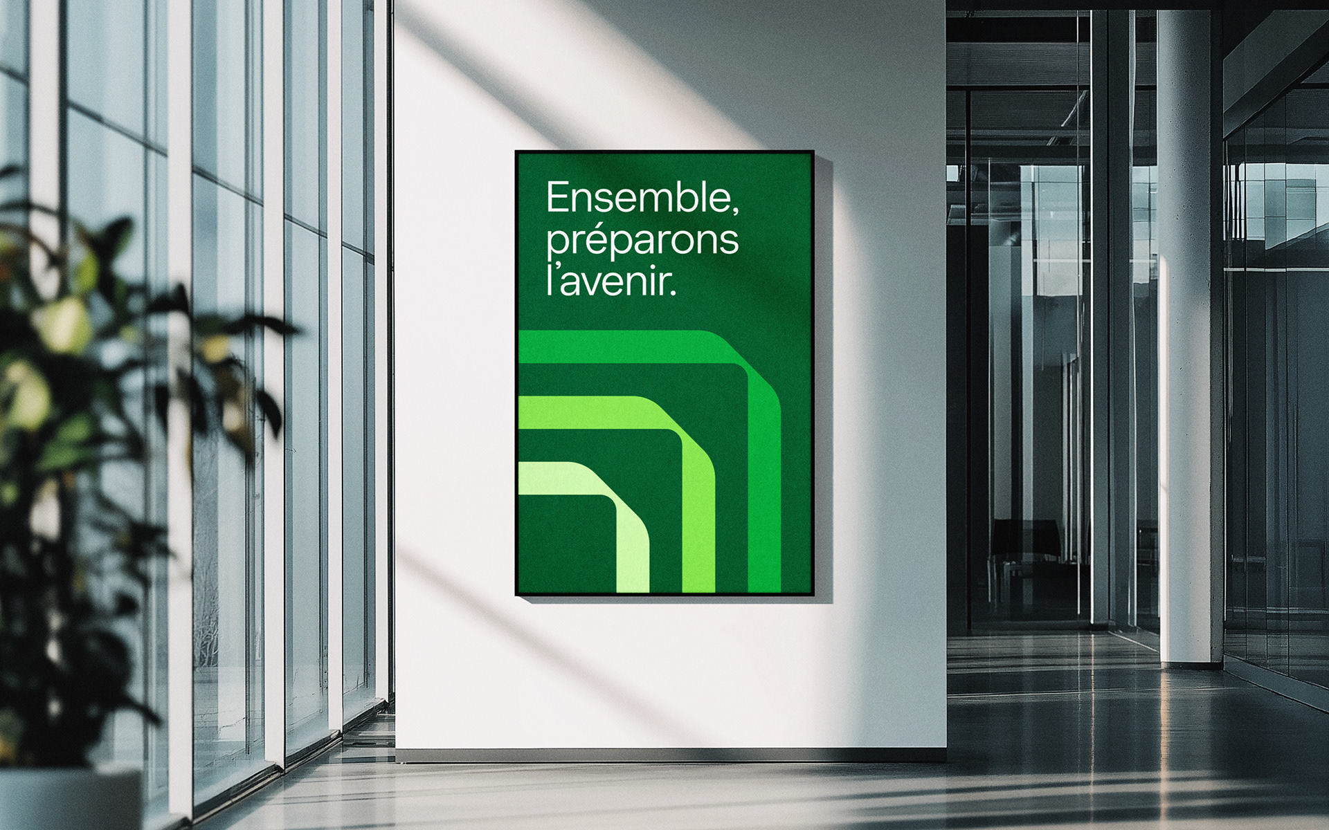
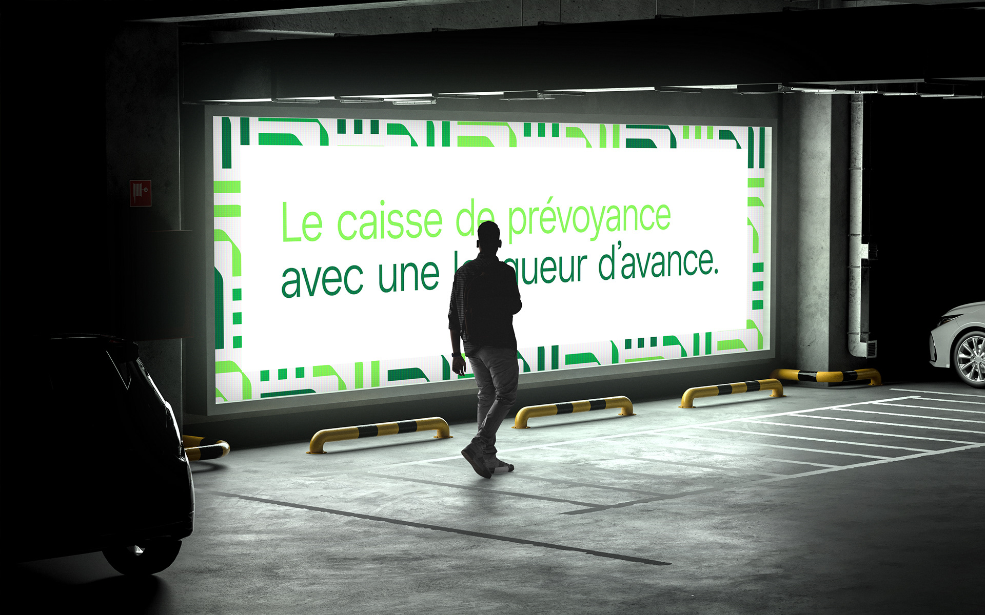
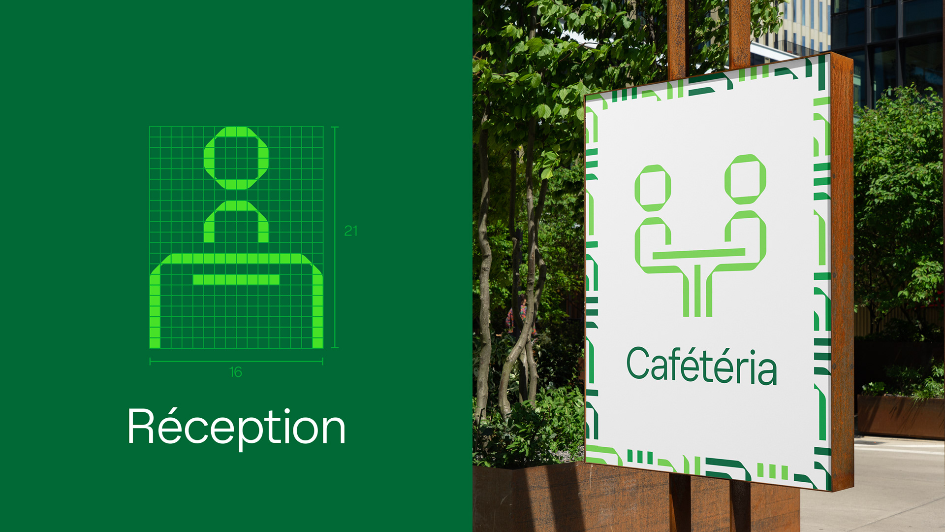
But the rebrand goes far beyond the logo: a full brand ecosystem was developed — from an iconographic system based on the chevron, to layout principles, patterns, and motion design that all reflect the brand’s signature direction: upward and forward. A visual system that embodies the very values it communicates.
In a sector often associated with rigidity and conservatism, the new identity positions CPEG as a modern, public institution with purpose — future-focused, enduring, and proudly human.


Credits 🌳
AGENCY: Parenti&Co: The Branding Studio
CLIENT: CPEG - Caisse de Pension de l'Etat de Genève
MANAGING DIRECTOR: Lisa Parenti
CREATIVE & ART DIRECTOR: Elie Kupsc, Abel Nadin
ACCOUNT DIRECTOR: Lorna Steele
STRATEGIST: Flavia Engelmann
MOTION SYSTEME: Abel Nadin
CASE STUDY VIDEO: Vincent Duret
GRAPHIC DESIGNER: Abel Nadin, Elie Kupsc, Nicolas Bula, Antoine Rudaz